In this post I will be evaluating pictures which I have taken for my unit in photography. I shall be evaluating how the pictures look as well as the level of professionalism achieved. A total of nine pictures will be evaluated which correspond to the genres chosen for this project.
Landscape Photography
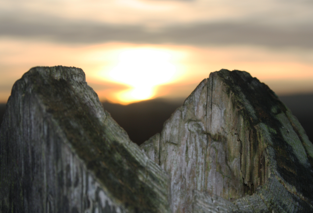
Out of the three pictures i've chosen to use in my landscape photography project I feel this one stands out the most as it is an optical illusion of sorts. The wooden post in the picture has been said to look like two mountains and people who have looked at it have given it a second glance. Due to this the image has already received positive feedback. Due to this feature of the image it may stand out to those glancing over several pictures.
The sky in this image has blends of orange, yellow and grey which presents contrast within the image. The colours in the sky look almost water colour-esque which makes the picture look like a painting.
I believe this picture achieves a moderate level of professionalism as it is framed well, meaning there is no wasted space in the picture. The picture is also well focused on the features in the foreground as well as the background.
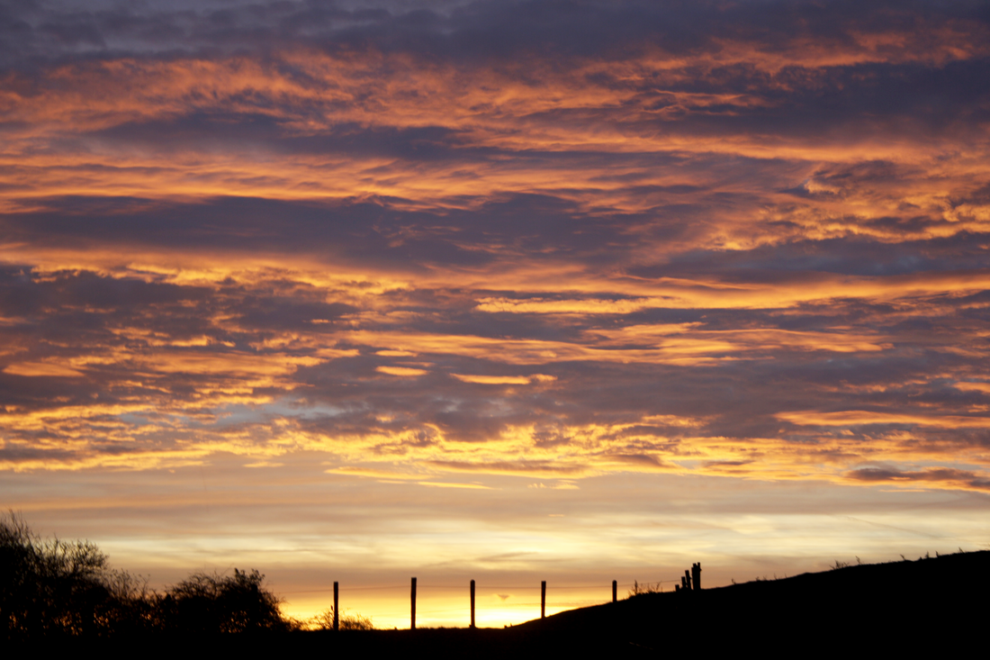
This picture used the silhouettes of the posts on the fence as well as the orange tinted clouds in order to stand out. Like the first picture the sky has a similar appearance which presents the same soft grey colour blending with the oranges.
Contrast is presented in this image with use of black silhouettes used at the bottom of the picture which then moves onto brighter colours as you move up towards the top of the picture. These bright colours and nature of the clouds may draw people in.
If there is anything I would change about this picture it would be the right-hand side of it. I would like to crop part of it out so there wouldn't be too much of the hill presented in order to make the image more centralised. Due to this issue, the image doesn't appear as professional as it could have; to achieve a higher level of professionalism I should go back to editing this picture to make any needed changes.
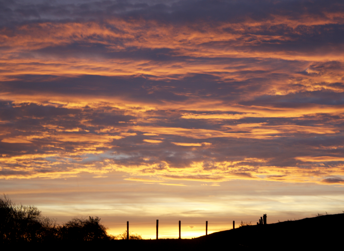
After looking at the picture and finding weaknesses within it, I went back to photoshop and made a change to the image. This version is smaller due to cropping the right side in order to cut out any unnecessary space which centralises the image to focus more on the silhouettes as well as the light behind them.
Now that the image has been cropped and centralised there isn't as much wasted space as the first version of this picture; I feel it achieves a higher level of professionalism when compared to it's counterpart.
When asked, people have said they like the colours presented in the sky as well as the use of the silhouettes in front of the sun. Criticisms have been that there is possibly a little too much room on the right hand side of the image and that maybe some of it could have been edited out. Once I was told this I went back to edit the image and came to the above result.
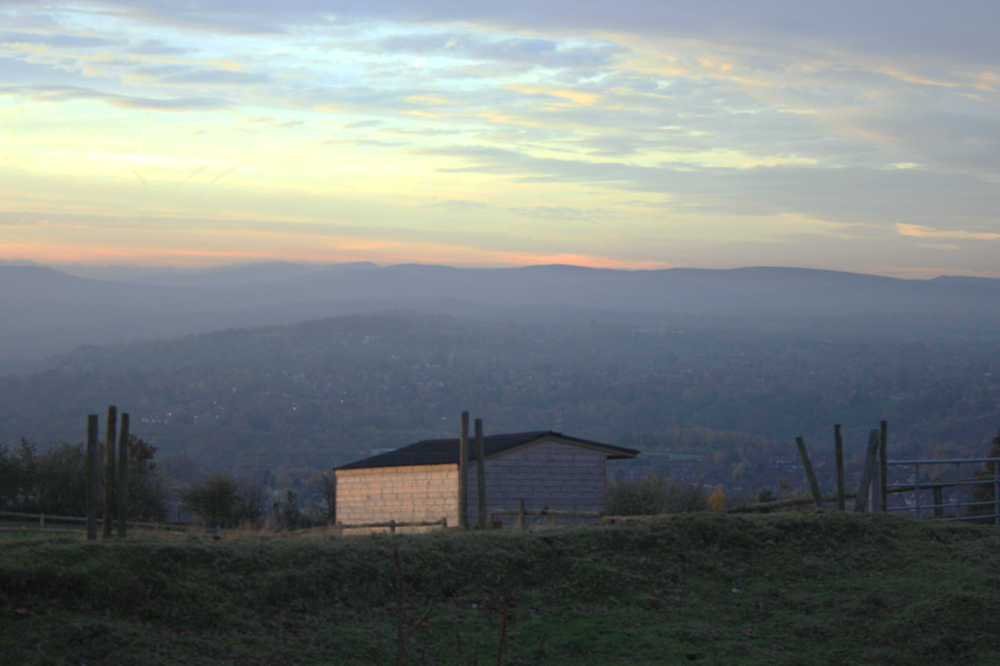
This picture focuses on the building in the foreground while using the background to impact the image with the vastness of the landscape. The posts on either side of the building section off parts of the picture; making it look like they are framing the landscape.
I have tried to brighten the picture up due to the background being quite dark; although when i've tried it either appears too bright or too grainy. Due to these drawbacks I believe this image is the weakest of the three chosen for my landscape photography.
With the pictures dim background the level of professionalism in this picture is much less when compared to the other pictures used for my landscape photography.
Feedback received from people has told me that they like the sky in this image and the hills in the distance. People have also mentioned that they like the use of the poles on each side of the building.
Some criticisms are that the center of the image is too dim and that it is difficult to see what is there.
Architectural Photography
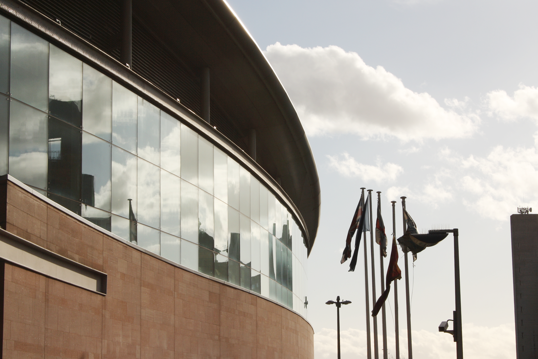
This picture primary makes uses of the reflections on the windows for effect; they allow for the picture to be brighter due to the presence of more white in the picture. Curves on the building add contrast when compared against the multiple flagpoles to the right.
A weakness this image has is that the flagpoles are too dark and the area to the right is too populated. In order to fix this some elements need removing and others brightening.
A weakness this image has is that the flagpoles are too dark and the area to the right is too populated. In order to fix this some elements need removing and others brightening.
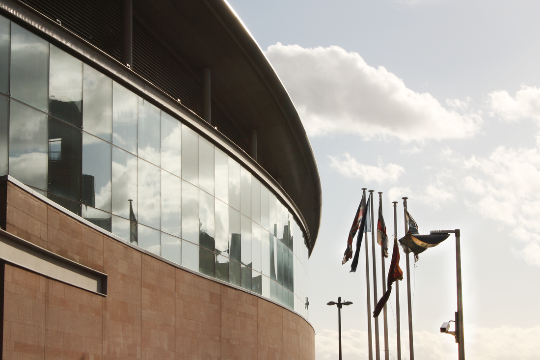
Now that the flagpoles have been brightened up they are more visible as well as more pleasing to look at; the building to the far right has also been removed as I felt it was an unnecessary feature. Removing this building also allowed for more of the sky to appear in the image as there wasn't much of it there to begin with.
With these changes made more professionalism has been added to the picture and it now looks more realistic.
Feedback has told me that where some people like the brightness in this picture, others find areas around the clouds to be too bright, which washes out the clouds somewhat. I have also been told that the use of reflections was a nice effect by some, but for others it seemed too jarring – adding to the washed out effect on the clouds even more.
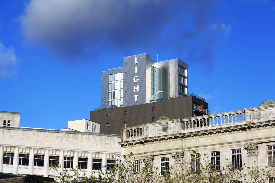
With this image being bright to begin with the word 'Light' on the silver building fits in well. Contrast is presented in this image with the dark cloud in the clear sky; as well as it being above a building with the word 'light' on it. During editing the image was sightly brightened up as the foreground was a little dim; parts of cloud were also removed in order to add more blue to the picture.
The picture is well framed and added elements of the environment around the main focus of the image; allowing for more warm colours to be presented, which brings more positive features along with the word 'light'.
Due to the brightness, positivity and framing of the picture I believe that this picture achieves a high level of professionalism.
Feedback has told me that people like the dark cloud above the building and some thought it was photoshopped in at first glance as it seemed perfectly placed, especially in a clear blue sky.
Criticisms have been that some find the picture to be a little on the bright side.
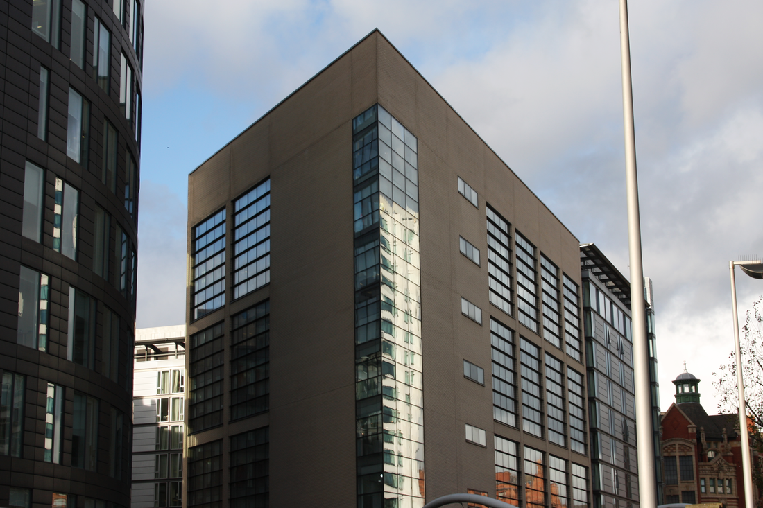
Like the first image this picture also features reflections. The image becomes somewhat brighter when looked at from left-hand-side to right-hand-side. This picture as a whole features mostly dimmer colours with brighter ones behind the brown building or being reflected off it's windows.
One issue with this picture is that the top of a bridge can be seen at the bottom of the image. With this present in the image it draws the eye away from the main feature of the picture. In order to get rid of this I need to crop the image.
One issue with this picture is that the top of a bridge can be seen at the bottom of the image. With this present in the image it draws the eye away from the main feature of the picture. In order to get rid of this I need to crop the image.
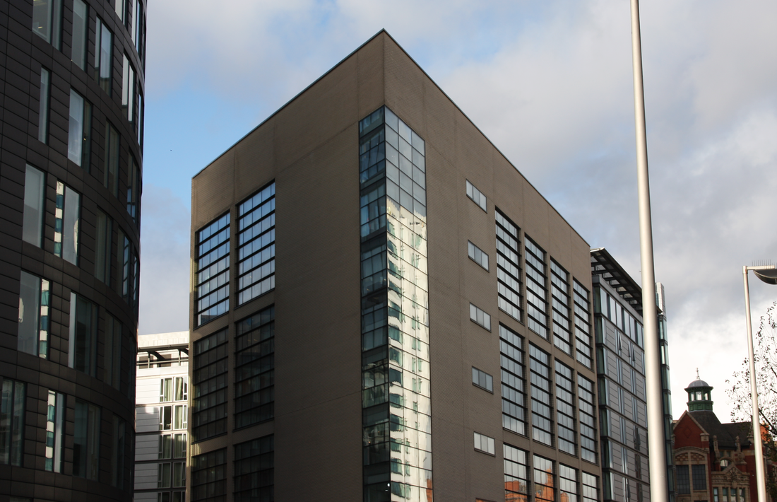
Now that the top of that bridge has been removed the picture now fully focuses on the building in the centre without any unnecessary structures covering it.
I believe this picture achieves a moderate level of professionalism due to the features displayed such as the reflections on the windows as well as how the picture is framed.
Feedback has told me that this image could be brighter in some areas as most of the picture consists of darker colours or shade. People have mentioned their fondness of the angle of the building as well as the reflections on the windows. Compared to the other image, which uses reflections, this one seems to be less jarring.
Black and White Photography
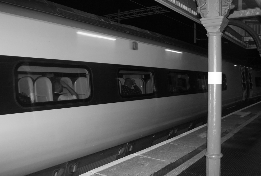
The main focus of this picture is the train which makes use of the top and bottom left corners and appears to get smaller as you look across the picture. Due to this it makes the picture pleasing to look at as the lines go from near to far.
The pole in front of the train appears a little too bright and draws the eye to it too often. In order to make it darker I need to use the burn tool in Photoshop; doing so will improve the level of professionalism in the picture.
The pole in front of the train appears a little too bright and draws the eye to it too often. In order to make it darker I need to use the burn tool in Photoshop; doing so will improve the level of professionalism in the picture.
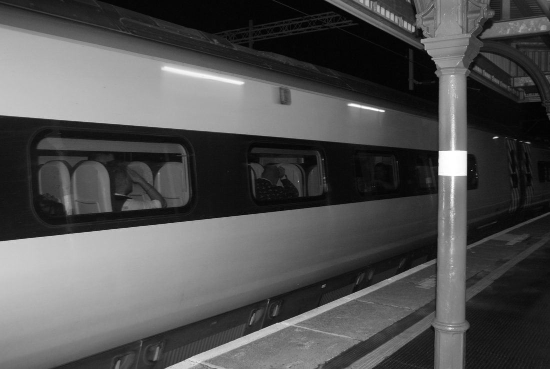
Now that the pole is darker it fits in more with the image and does not stand out due to it's brightness. The only thing that stands out about the pole is it's white stripe; as long as the pole itself isn't bright I believe it fits into the image nicely. A fine level of professionalism and realism has been achieved with this picture with the use of lines becoming smaller and the way it is framed.
When asked people have said they enjoyed this image as the colours start of light and become darker. People have also said they like how the train uses the near corners of the image.
Criticisms have been that the white stripe on the pole distracts them from the rest of the image.
When asked people have said they enjoyed this image as the colours start of light and become darker. People have also said they like how the train uses the near corners of the image.
Criticisms have been that the white stripe on the pole distracts them from the rest of the image.
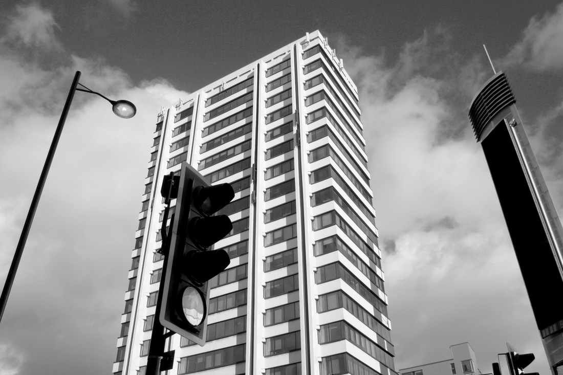
This picture focuses on all four main structures presented. The way the structures in the foreground are presented makes it appear as though they are falling while the building in the background remains unchanged; this could create an optical illusion.
If there would be anything I could change about the image it would be the sky at the top of the image as it appears grainy. I have tried to edit this but I haven't been able to get rid of the graininess; though it isn't too much of a problem as you can only see it if you look closely.
Overall I believe this image achieves a moderate level of professionalism due to how the structures are presented.
When asked, people have said they like how everything in this image is angled like they’re almost falling over. Criticisms have been that the bottom circle on the traffic light reflects too much of the environment and distracts them. This issue has also arisen in the train station picture.
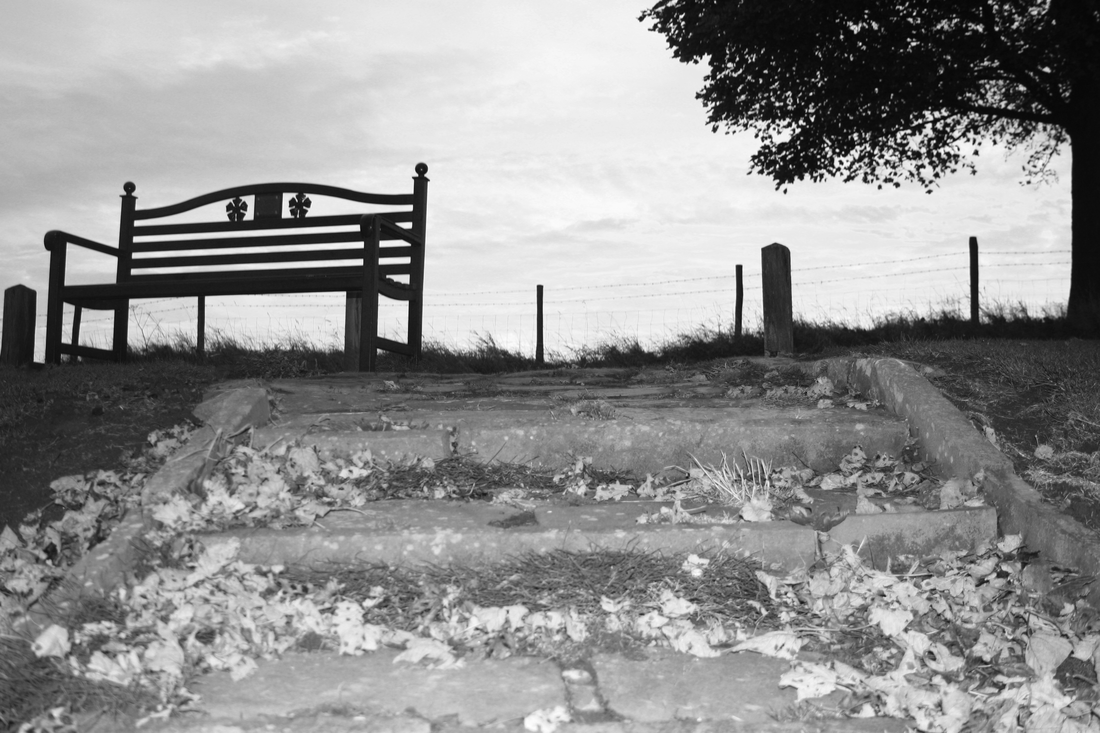
The feature that draws my attention the most would be the bench at the top of the stairs possibly due to how dark it is compared to the rest of the image. This picture could be treated as a point of view shot as it could appear as though the viewer is walking up the stairs; due to this those looking at this picture may be able to imagine being in this scene.
During editing a lot of clutter around the stairs was removed in order for the image to look cleaner. Overall I like how the image has been framed including the angle of the bench as well as the direction it's facing. I also believe a moderate level of professionalism and realism has been achieved.
People have said that they like how the bench and tree in the background were used but they thought the leaves on the stairs were brighter than needed; this is possibly due to the amount of leaves piled together.
 RSS Feed
